Don’t be the cool penguins – invite Access over for a chat.

It’s been interesting recently to see accessibility from a mainstream perspective recently, particularly as I work through a course on visual design.
I expressed horror at the use of text boxes whilst acknowledging that they are a neat tool for getting certain programs to align text.
“But they’re not accessible”, quoth I.
“Not to worry”, replied the tutor, “Let’s get the visuals right and we can sort accessibility later. This exercise is for print anyway.”
Now, I totally understand where he’s going with that statement, if you’re designing for print then the only accessibility you need concern yourself with is, indeed, visual. The trouble with that is we live in a world where material is used and abused in all sorts of formats. I can pretty much guarantee that the pretty print brochure you’re working on will be slapped willy-nilly on the website for downloading. I can also bet, with pretty good odds, that it won’t be accompanied by an accessible version of the information.
So what should we do? My view is that when designing a print resource that we should do our very best to use accessible tools and assume that it will appear as an lectronic version somewhere. It’s not hard to do – at the very least you could do as a document I recently had to work with did – they did all their text as graphics, but put decent ALT text on them. At least no information was lost (unless their colour and font choices caused you problems). I’m not arguing for perfection just making accessibility part of your design team rather than the awkward kid that gets picked last every time.
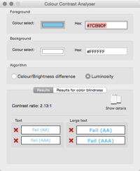
A great tip is to use the Colour Contrast Analyser to define colours that work for the web or electronic documents and then convert them back to a suitable print equivalent.

If your designers insist that they can’t work with RGB values then there are plenty of online tools to convert RGB to CMYK such as Rapid Tables.
While we’re talking visual design here’s a neat article discussing some aspects of designing for colour-blindness (and great to see low vision getting a shout out too)
http://www.lireo.com/3-ways-improve-accessibility-designs/?utm_content=buffer71a6b&utm_medium=social&utm_source=twitter.com&utm_campaign=buffer
If you want to know more about creating accessible content why not give me a shout at Access1in5. It’s what we do after all.
